In this article you'll find detail overview of the features, packed in DMXzone Bootstrap 3 Components extension. Each of the six components are easily accessible from the panel and can be customized the way you want them to appear on your website.
DMXzone Bootstrap 3 Components Reference
Explore the features in detail
Features
What you can do with the extension
Enhance your website with components
Improve the user experience on your website by adding useful components, which will help them navigate easier so that they don't get lost. This way you can provide tips and additional info, without overcrowding the page. Keep the design clean and simple for the best impact and results.
Simplify your pages with well-organized content
Keep it simple is something we can hear very often when it comes to content and it's true. It's easy to achieve it if you keep away your content from over-structuring with too many images, info, buttons and so on. And this is exactly when you need to consider using components, which will "hide" most of them for the best user experience.
Tooltip properties
Create beautiful Tooltips
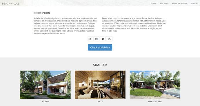
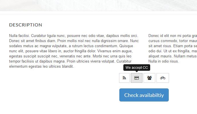
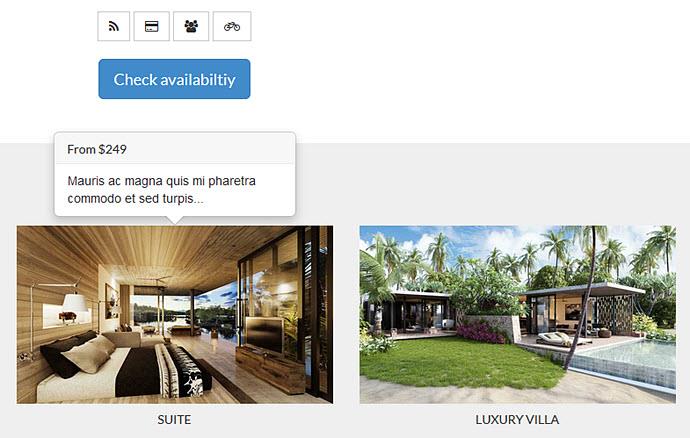
Guide your users through your content with useful tooltips. You can put bubble-like tips on any feature, button or text and show them what they need to do. Tooltips can be greatly appreciated on buttons with no text or when you need to add additional information such as links, images or simply any HTML content.
Customize the tooltip
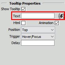
From the various options provided in the property inspector you can add a text or any HTML content, which can also be dynamic, thanks to the great integration with HTML5 Data Bindings.
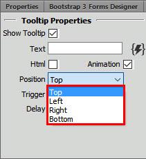
Position the tooltip
You can choose between four positions for the tooltip - top, left, right and bottom.
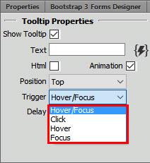
Appearance of the tooltip
Select the action, which will trigger the tooltip to show up on your page.
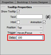
Time for the tooltip to show
If you have a number of tooltips around your page you certainly don't want them to appear at the same time. You can set the time in ms for the small pop-up box to show when the user moves the mouse pointer over the element.
Popover properties
Enrich your content with Popovers
Very similar to tooltips, this great component allows you to add even much more content. The popover is an elegant and modern way to provide your users with secondary info for an element. It also gives you the opportunity to have a title and a header for your content.
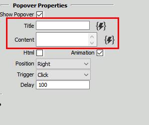
Title and content
Add title and content for your popover to display additional info. Both can be from a dynamic source.
Position the popover
You can choose between four positions for the popover - top, left, right and bottom.
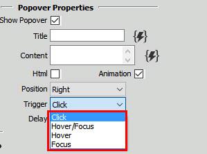
Appearance of the popover
Select the action, which will trigger the popover to show up on your page.
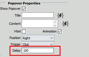
Time for the popover to show
If you have a number of popovers around your page you certainly don't want them to appear at the same time. You can set the time in ms for the pop-up box to show when the user moves the mouse pointer over the element.
Modal properties
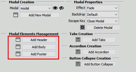
Add modal elements
Add elements to your modals such as header, body and footer and customize them to fit your website design.
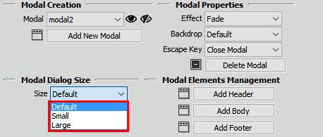
Choose modal size
Depending on the content that you want to put within a modal dialog, you can choose between large, small or the default size.
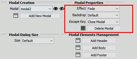
Customize the modal appearance
From the various available options you can easily customize the modal dialog with effects, how to be closed and also provide a click area for dismissing shown modals when clicking outside the modal.
Add smart Modals
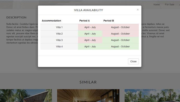
Provide modal windows to improve the usability of your website. You can use numerous interface elements and structures to organize your content but with modal windows, which are basically windows that float above the page, you can never go wrong. Modal windows also allow you to save space by getting rid of large elements that don’t need to be on the main page.
Accordion properties
Customize the accordion
Add, move or remove panelss with just a mouse click. It's also super easy to change the titles and the content.
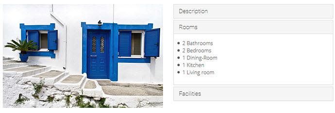
Add your content within Accordions
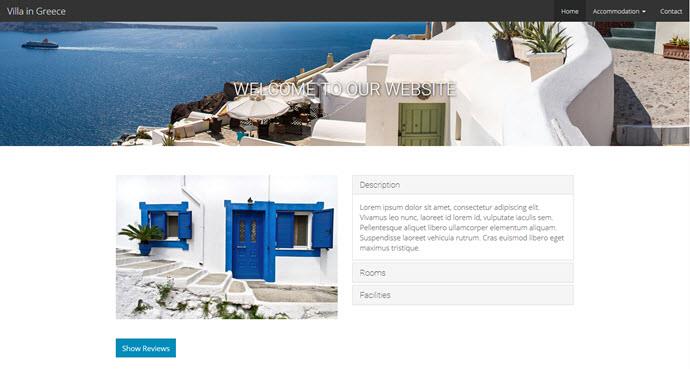
The great thing about accordions is that you give your users the opportunity to select, which part of the content to read. Separated with great headers and titles into accordion-like sections, your content is easily accessible and well-stacked.
Tabs properties
Customize the tabs
Add, move or remove tabs with just a mouse click. It's also super easy to change the titles and the content.
Place your content within Tabs
Pretty similar to accordions, tabs are also an amazing way to summarize a great amount of content into meaningful sections, which occupy less screen space. Due to their shape and functionality, they add an interesting UI element which is intuitive to use and also very hard to miss by users.
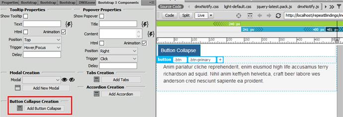
Button collapse creation
Customize the button collapse
With just one click you can add a button collapse and customize it the way you want it.
Add additional info with Button Collapses
With a simple click, you can offer the ultimate user-experience. Using button collapses, you can allow expanding of vast amount of content, which will never interfere with the design and simplicity of your website. It's simple, yet effective way to "hide" additional info.
Lubov Cholakova
 Lubov has been with DMXzone for 8 years now, contributing to the Content and Sales departments. She is bringing high quality content in the form of daily blog updates, reviews, tutorials, news, newsletters,update emails and extensions' manuals. If you have a product that needs publicity or any other questions about the entire DMXzone community, she is the one you can contact.





Comments
Be the first to write a comment
You must me logged in to write a comment.